Web · 2026
Website Migration & Redesign
Our website just wasn't keeping up with how good our service is. So I pitched moving off WordPress and away from our outside agency, then led the whole move to Framer. Now marketing can build, ship and measure the site on our own.
Where we started
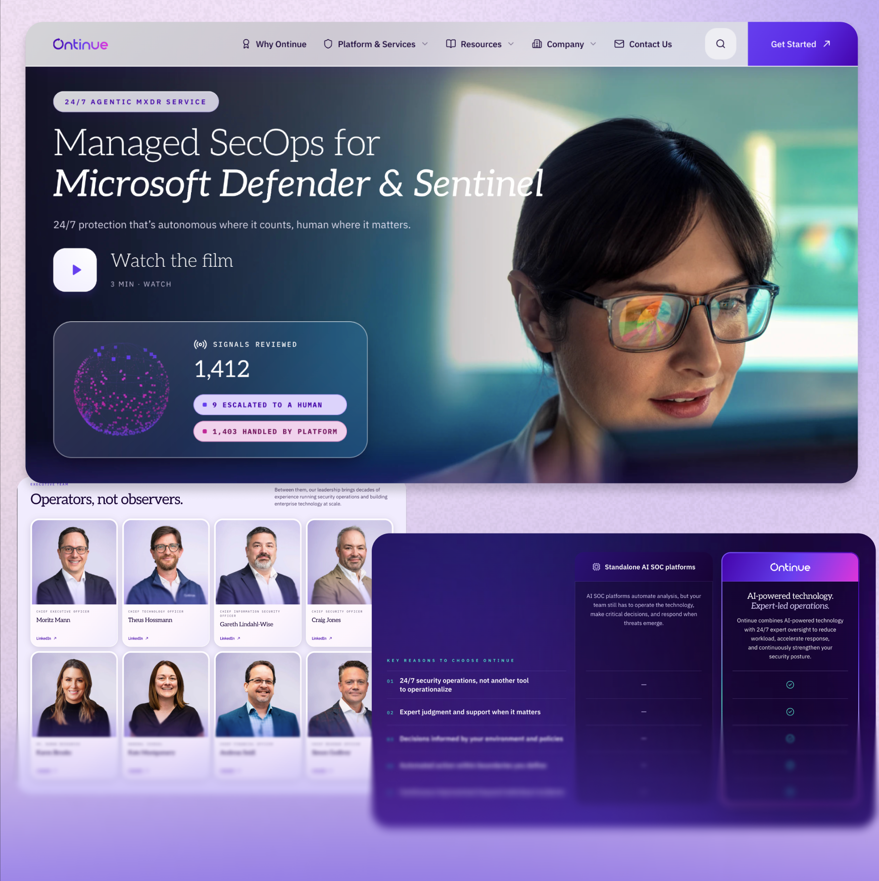
A great service with a website that didn't show it
I took over our website a few years ago, after a round of layoffs, from what used to be a director of web role. That meant managing the dev agency that handled the bigger page and module builds, while I took care of content and image updates myself. It didn't take long to see the problem. New builds took way too long, and what came back usually wasn't up to our standards.
The site itself was showing its age too. It ran on WordPress, about three quarters of every change meant an agency ticket and custom code, the resource center was basically a folder of PDFs, and our analytics didn't tell us much. More than anything, it lacked polish. It didn't feel modern, and it didn't really pull you in.
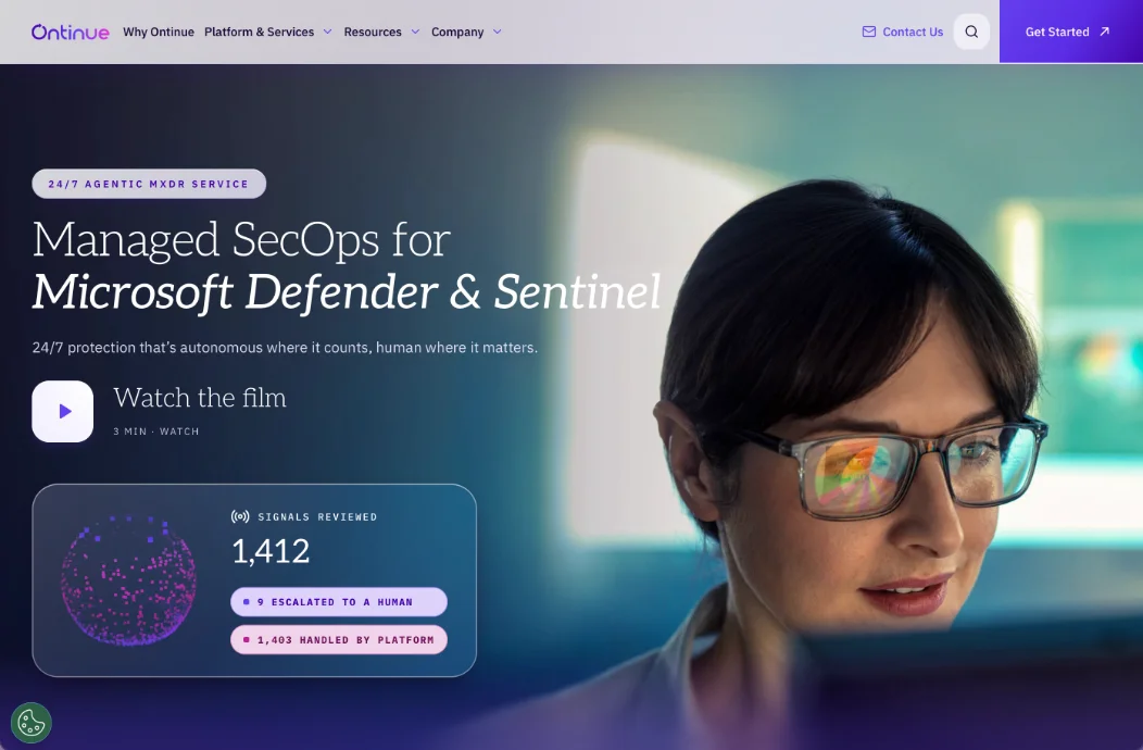
That mattered, because our website should reflect the quality of our service. Ontinue sells AI powered MXDR, but at the end of the day we're helping real people in real organizations with real problems. The site needed to feel modern and human at the same time. Nobody asked me to fix it, but once I saw the gap I couldn't unsee it, so I brought it to leadership with one idea at the center: our website is the demo before the demo.
How I pitched it
Our perfect website, in six parts
Before we talked platforms, we agreed on what our perfect website would actually do. We landed on six things that would make it a real growth engine, and they became the yardstick for everything after: how the old site stacked up, and what the new one had to deliver.
Marketing autonomy
Own it
Own our content and design, with minimal code and no agency.
BeforeAbout 75% of our changes went through the agency as custom code.
AfterFramer works a lot like Figma, so what we design is what ships. No agency ticket needed.
Dynamic content
Look like a media powerhouse
A resource experience built for SEO and lead gen.
BeforeThe resource center was a folder of PDFs.
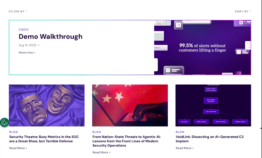
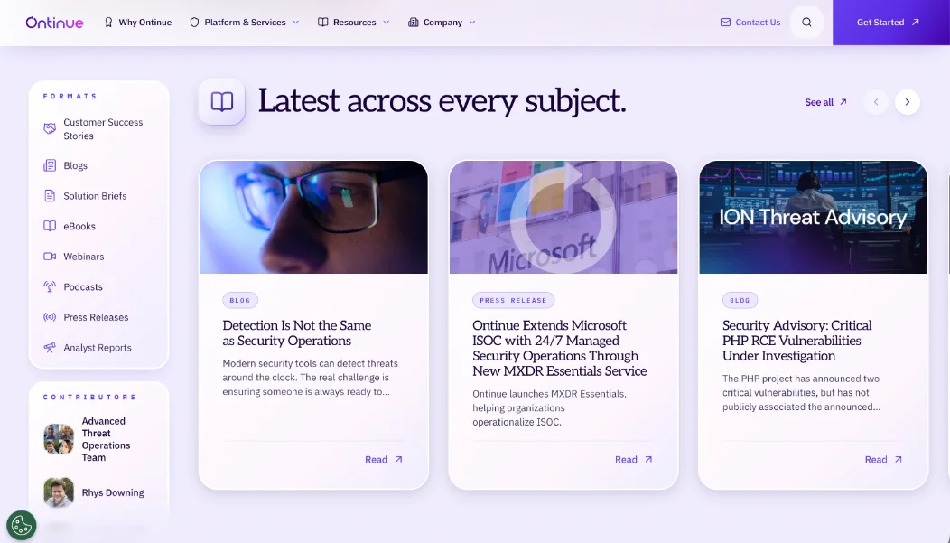
AfterA real CMS that runs our resources and gated content.
Agility
Move fast
Ship pages and updates ourselves, without the wait.
BeforeNew pages and modules took weeks, sometimes a month.
AfterAI page generation gets us from a prompt to a responsive page in minutes.
Modern UX & brand control
Make it impressive
Responsive, animated, and backed by a premium design system.
BeforeFlat, static and pretty forgettable.
AfterSmooth motion and a polished design system, built right in.
Analytics & insights
What's working
See traffic and engagement, and A/B test what we build.
BeforeOur analytics were vague and we couldn't test anything.
AfterTraffic, engagement and A/B testing are built in, so we can test our way to more conversions.
Built to scale
Future proof
Persona messaging and AI native features, without a rebuild.
BeforeNo personalization, no AI, and no clear way to get there.
AfterMessaging tailored to each persona and an AI ready roadmap, without rebuilding the site.
The hard calls
Decisions that shaped the project
A project like this comes down to a handful of big choices. These are the ones that mattered most.
01
Framer over Webflow, even though I walked in preferring Webflow
Going into the evaluation, Webflow was actually my pick. But it still needed a front end developer, so it wasn't really no code, and the whole point of this was autonomy. Framer is a true design first tool, with room to go deeper in code when we need to. It also fit our budget much better, and after full demos of both, Framer felt better positioned to grow with us.
02
Walking away from WordPress and our agency
None of us, me included, were happy with the quality we were getting, especially for the price. And with how fast AI tools were moving, we knew there was a better way to build and ship faster, at a higher quality. Once we lined it all up, cutting WordPress and the agency was an easy call.
03
Turning a migration into a refresh
This started as a straight migration, but working with my VP of Marketing we saw easy wins in refreshing the brand and the web design along the way. Product marketing spotted a few of their own, like rebuilding page content. So we built it out together in phases to launch sooner, moving our high traffic core pages first and bringing lower performing pages over in later phases.
Before & after
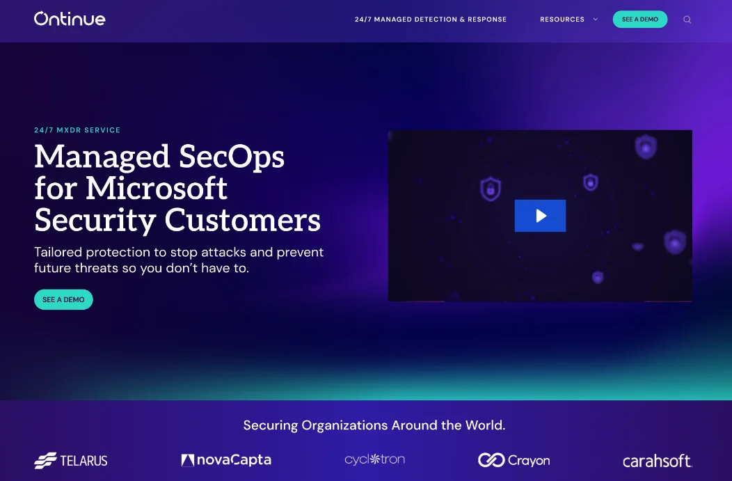
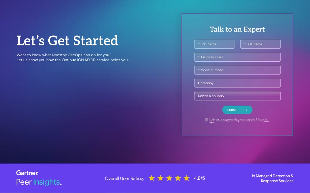
Same company, a much better first impression
Homepage
Resource center
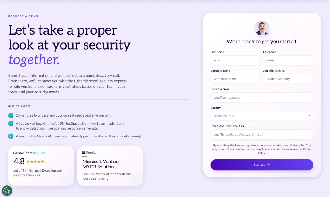
Request a Demo
What we had to move
Moving a live site without losing what it had earned
We had three priorities the whole way through: protect our SEO and organic traffic, launch fast, and keep the lead gen forms working. We were picky with the resource center too, moving what mattered and phasing out or archiving the rest.
117
Pages audited
280
Posts: PR, coverage, awards
253
Resource center entries
1,465
Hosted assets
My role
From idea to launch
This one started with me. I pulled together a small team from inside the company, and led it from the first platform comparison all the way to launch.
Picked the platform
I led a deep dive comparing Framer and Webflow, handled the price negotiations, and made the final call on Framer.
Made the case
I built and pitched the leadership deck around that six part scorecard, and got the green light.
Designed the system
I designed the full design system and page templates, then handed each one off to our Framer contractor to build as it was ready.
Ran the project
I built the plan and timeline, found the contractor to lead the build, worked with product marketing on content and IT on redirects and integrations, and gave our C suite a weekly readout on progress, hurdles and wins.
The process
Five phases over six weeks
- 012 weeks
Audit & strategy
We tracked every page, post and resource, decided what to keep, redesign or retire, and mapped out integrations like Marketo, GA4 and Tag Manager.
- 023 weeks
Design & build
We explored a few creative directions, then built the design system, components and templates for the homepage, product pages, blog and resource hub, along with the CMS structure.
- 032 weeks
Content & plugin migration
We moved pages and resources into the new templates in sprints, carried our SEO over, and reoptimized images along the way.
- 041 week
Integrations & QA
We hooked up Marketo forms, analytics and our other tools, then tested every form, link and layout across devices.
- 05Oct 30
Launch & training
We soft launched in staging for sign off, did the final migration and domain switch, and trained the team so they could run the site themselves.
Where we landed
Launched October 30, and built to grow.
It's still early, so the results are on their way. What matters is that everything we need to grow is in place from day one, and every one of those six goals is now something we can actually do.
Modern.
Finally as sharp as our service.
Measurable.
Analytics and testing built in, so we'll know what's working.
Ready to scale.
Room for personalization and AI, without another rebuild.
Ours.
Built and run by us, no agency needed.
Keep exploring