Brand · 2020
Reinventing an Icon
BlackBerry had already pivoted from phones to cybersecurity software, but the brand never caught up. When I stepped in as interim brand lead, I got to help change that.
Where we started
An iconic brand that was holding itself back
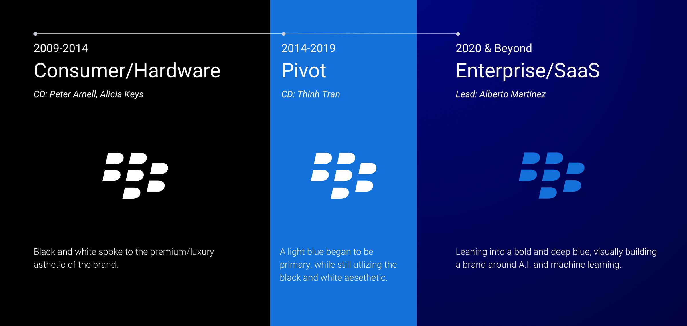
Most people remember BlackBerry as the king of the smartphone. What they didn't know is that BlackBerry's security software was always at the core of the product. When hardware demand dropped in 2014, the business pivoted and spent the next four years turning itself around. The problem was that the brand never showed any of that.
I joined the Brand Creative team to help move the brand from hardware to software. Think about it like this: if McDonald's stopped selling burgers to people and started selling its farm products to businesses, the brand would have to change too. My previous creative director and I took the first step away from the old tuxedo look and brought in some blue, but it was still one foot in and one foot out. When he retired at the start of 2020, I was made interim lead, and that was my chance to make BlackBerry a world class brand again.

Competitive analysis
Figuring out where we actually stood
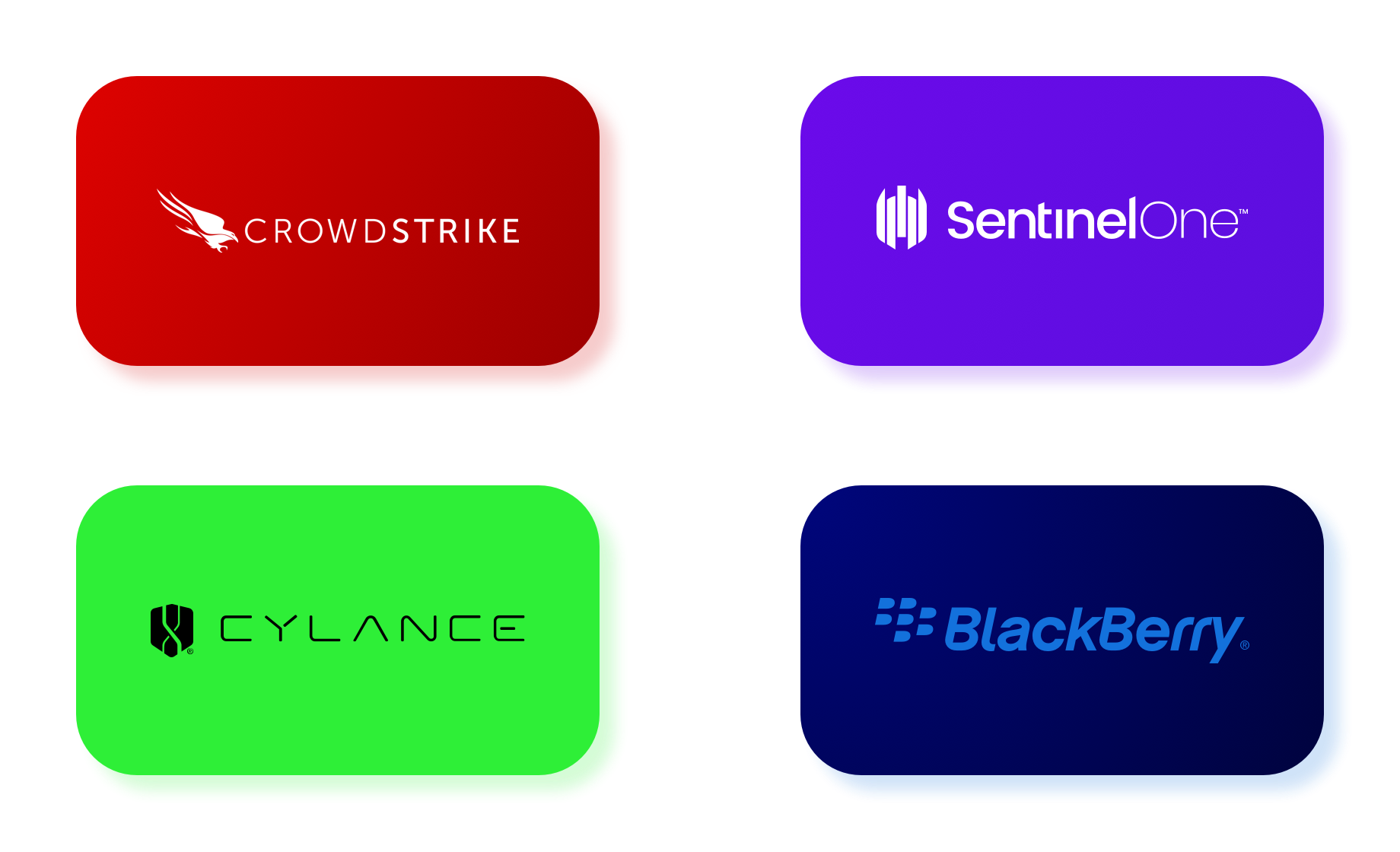
I started by looking at the whole cybersecurity landscape, mainly CrowdStrike, SentinelOne and Cylance (which BlackBerry had acquired). I wanted to know exactly how we measured up, and what the other brands were doing well. Honestly, our light blue always felt more like a healthcare company than one built to fight malware.
The question became: how do you take a legend from one sport and make it a contender in another? We needed to at least match the brands doing it right, then use thought leadership to pull ahead.
Evolving the brand
AI in everything we do
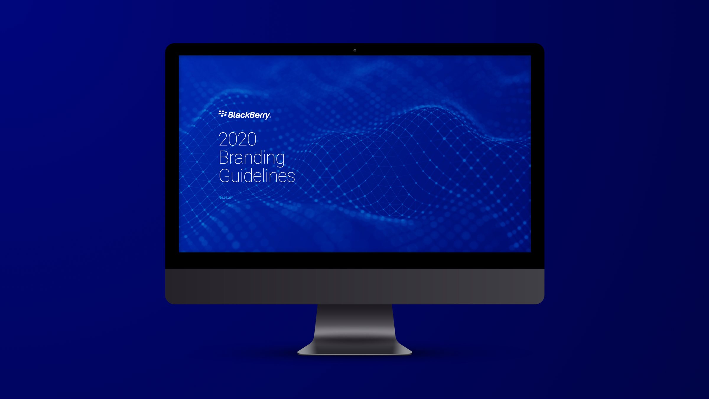
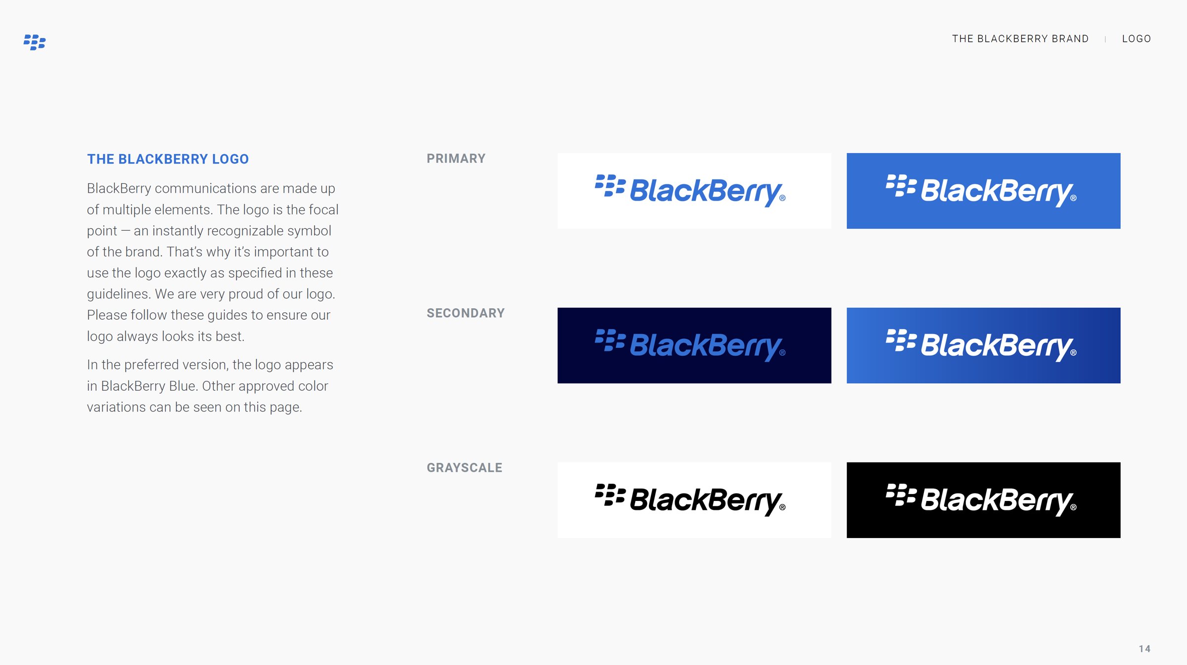
After the competitive work, I sat down with our CMO and we landed on what the brand needed to say: AI in everything we do. I explored a lot of directions, and after a few rounds I turned the approved direction into a full brand guide.
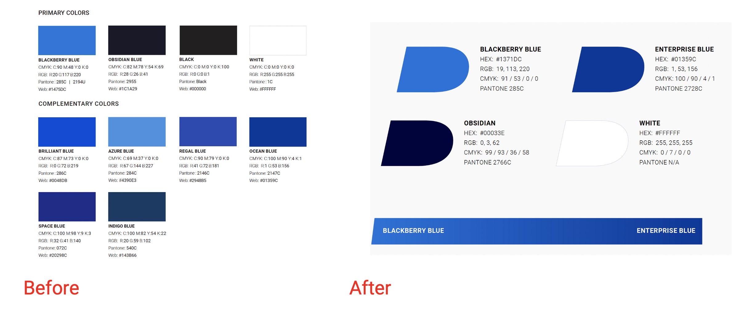
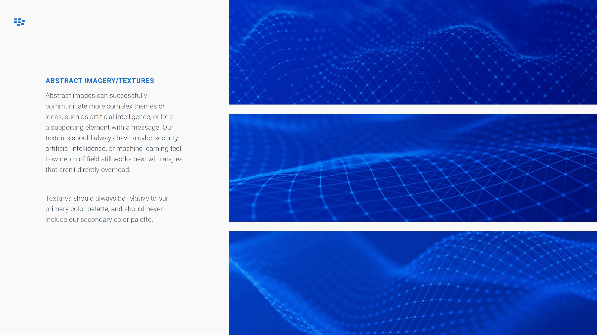
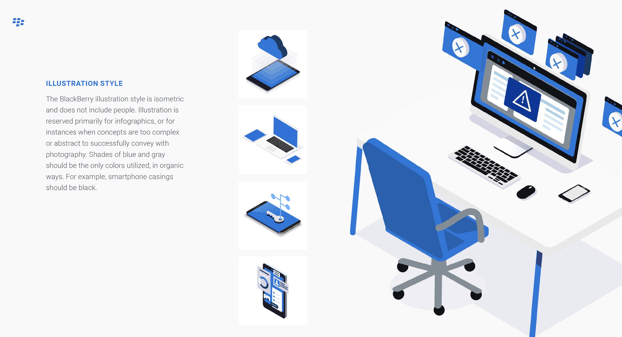
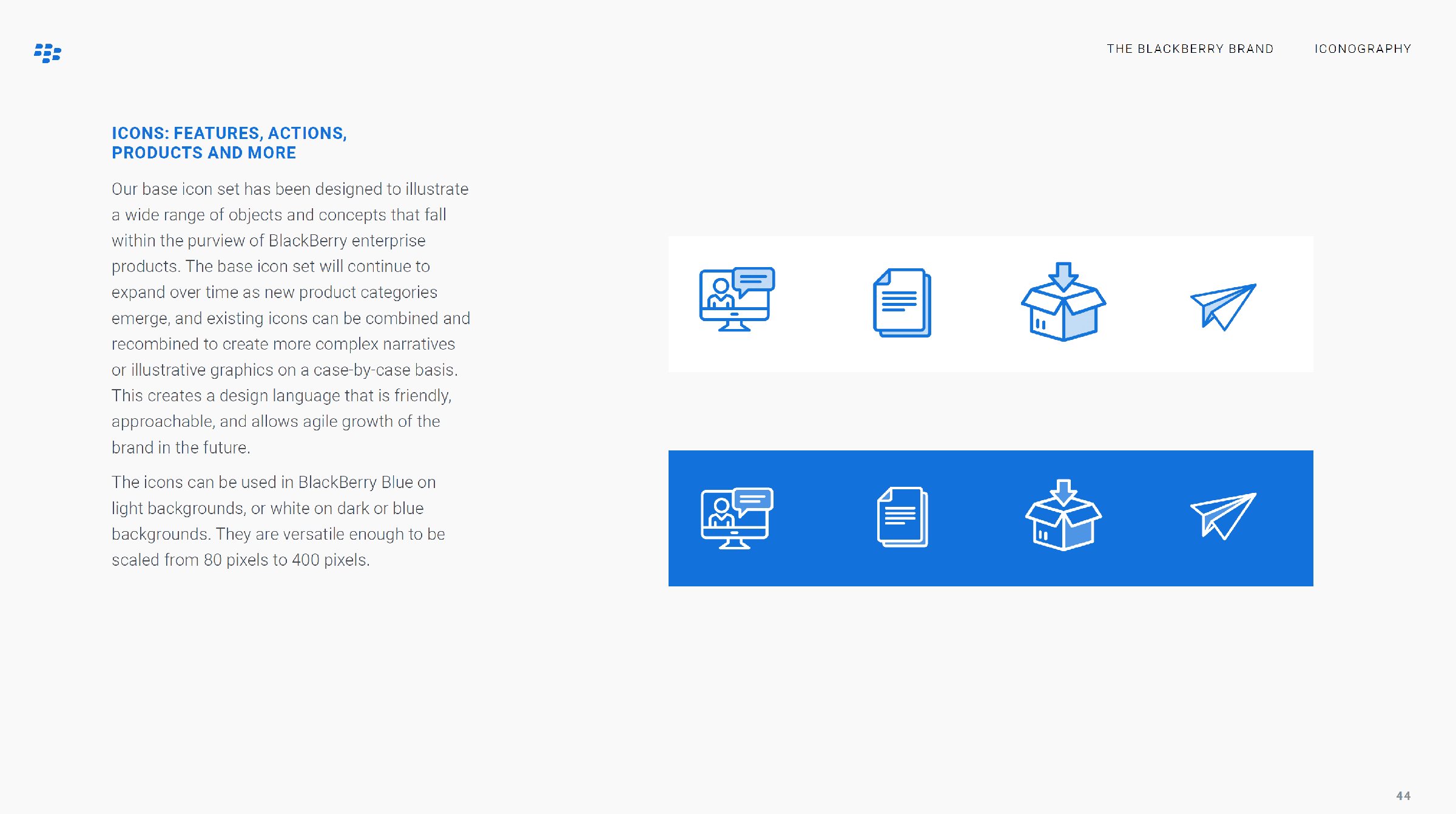
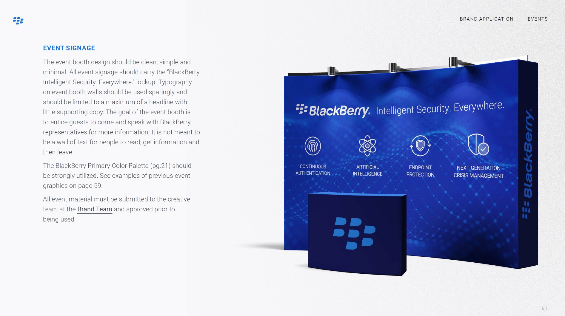
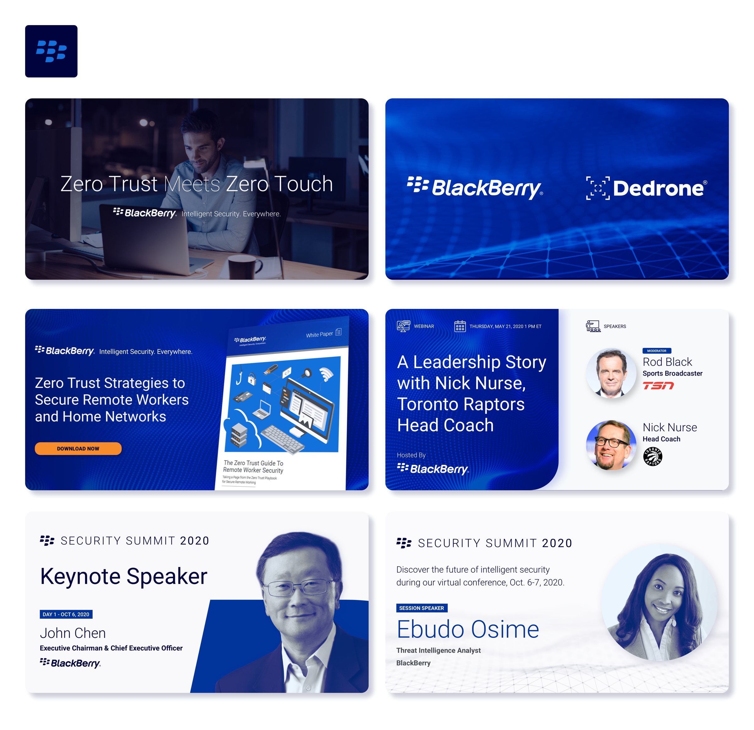
We moved the old black and white logo to greyscale only and brought in much deeper blues to show the depth of our AI. I also built a set of cybernetic textures to say what the business was about without leaning on copy, and introduced isometric illustrations to explain complex ideas that photography just couldn't. Then we carried it all through to trade show signage and social.
The website
Scaling it across the site
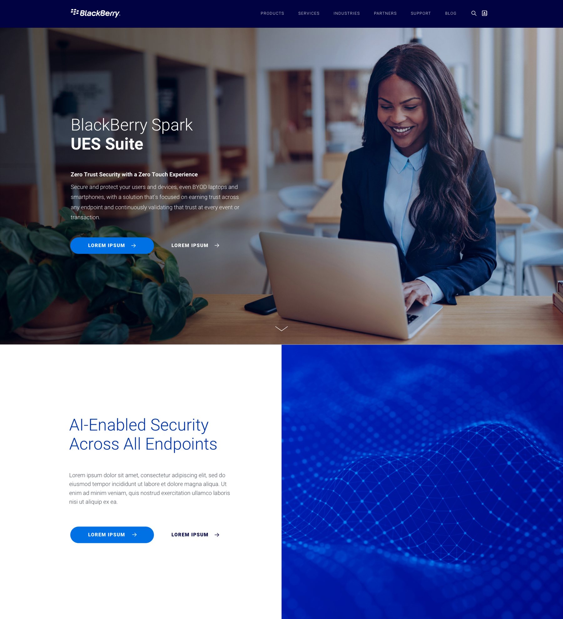
Our website needed sharpening too, so I worked closely with our lead web developer on a system of modules to keep every page consistent. We started with the nav colors and tightened up the type system from there.
Just for fun
Reimagining blackberry.com
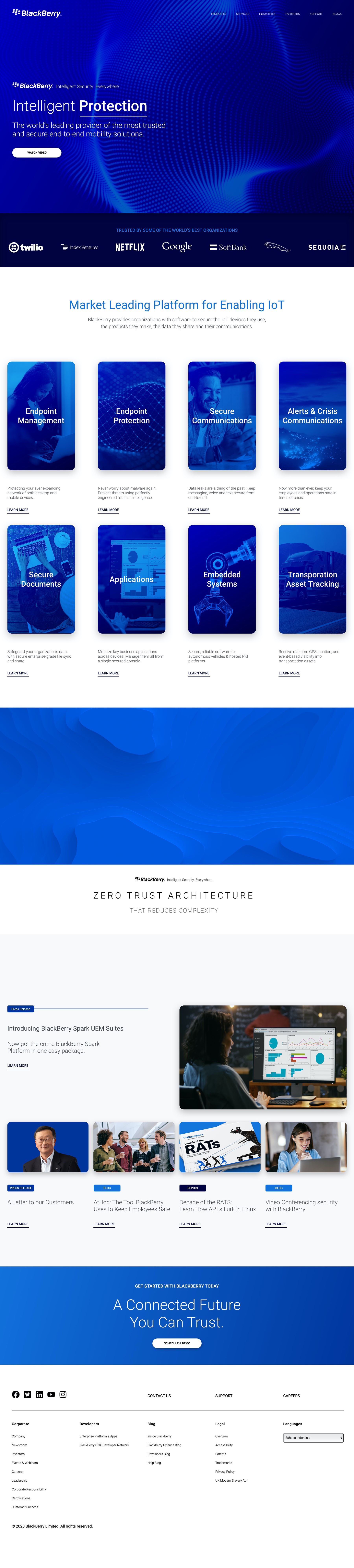
With the new foundation in place, I put together a full exploration of what our homepage could look like in that bold blue. This was an idea, not something that went live, but it showed where the brand could go.
Keep exploring