Brand · 2026
Brand Refresh
The brand behind Nonstop SecOps. Alongside our website move, I built Ontinue's new brand system, from logo and color to photography, icons and charts, and put it all in one living guide the whole company can use.
Why we exist
Starting with the mission
Every page of the guide has to earn one sentence: to remove cybersecurity as a barrier so organizations can focus on what matters most.
The refresh grew out of our website project. While we were rebuilding the site, my VP of Marketing and I saw the chance to sharpen the brand at the same time, so I built a proper system and published it as a living web page instead of a PDF.
What's inside
Ten chapters, one source of truth
Here's what the guide covers. The full system, with every rule, tint and example, lives on the site.
01 · Mission
The one sentence every other page has to earn.
02 · Logo
Wordmark, emblem, clear space and the Microsoft partner lockup.
03 · Color
Core, accent and signal sets, each with a clear job.
04 · Tints
Six steps for every primary, for diagrams, decks and interfaces.
05 · Application
How much of each color to use, in light and dark mode.
06 · Gradients
Twelve named gradients and four mesh fields, each with a meaning.
07 · Typography
Aleo and IBM Plex Sans, the full hierarchy, and a signature CTA.
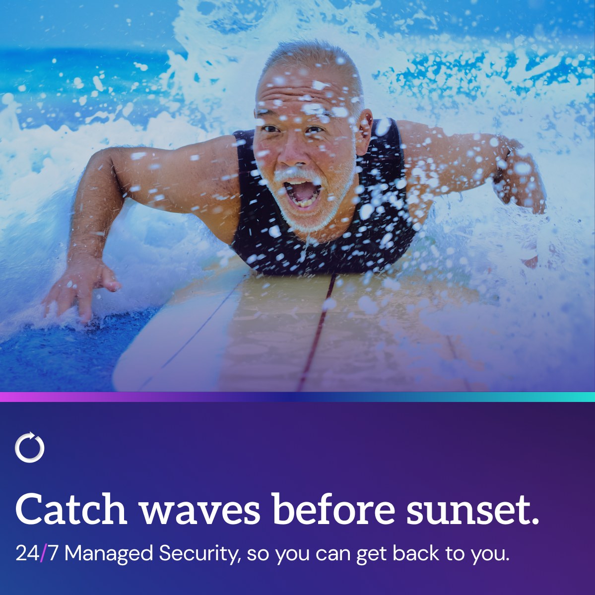
08 · Photography
Direction for every kind of image, plus a consistent headshot style.
09 · Iconography
Lit glass tiles with a single line weight, on a strict grid.
10 · Data visualization
One chart anatomy, used everywhere.
A preview
Boldly purple
Four core tones anchor everything, with Continuum, our default gradient, running Defender Plum to Ultra Violet to Cyber Pink.
Encryption
#0B0119 · Core
Phantom
#170335 · Core
Defender Plum
#4303A9 · Core
Ultra Violet
#653FEE · Core
Continuum
Headlines · Aleo
Aa
This is Nonstop SecOps.
Body · IBM Plex Sans
Aa
Read by a named analyst, not a template.



See the full system
This is Nonstop SecOps.
Gradients, tints, icons, charts and every rule in between. It's all live on ontinue.com.
Keep exploring